
- Wave
Demographics
kindergarten children in had an EDI started for them in Wave .
Demographics
| Total EDI | Mean Age | Males | Females | ELL | Special Needs |
|---|---|---|---|---|---|
| (%) | (%) | (%) | (%) | ||
Participation
| WAVE | School Year | Participated | Total EDI |
|---|---|---|---|
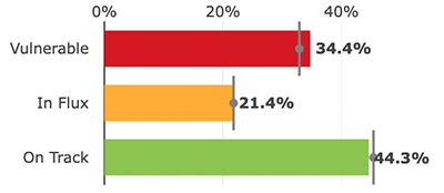
Overall Outcomes
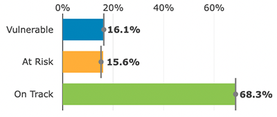
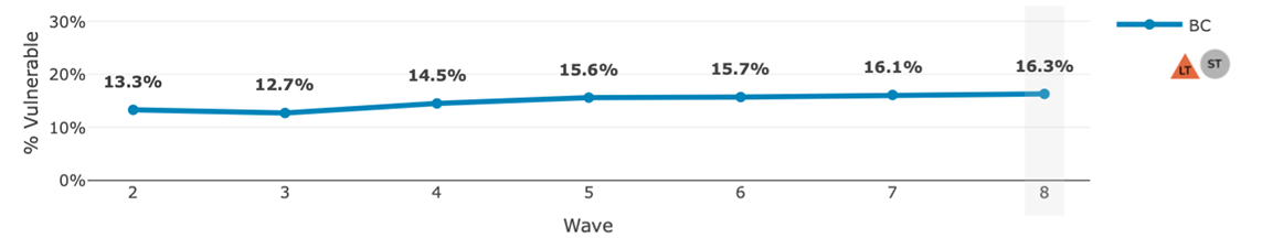
% or kindergarten children in were vulnerable on One or More scales of the EDI in Wave .
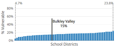
Map of Overall Vulnerability
Overall outcomes summary
Loading...
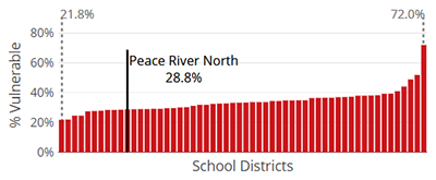
Range in Vulnerability
Loading...
Overall Trends
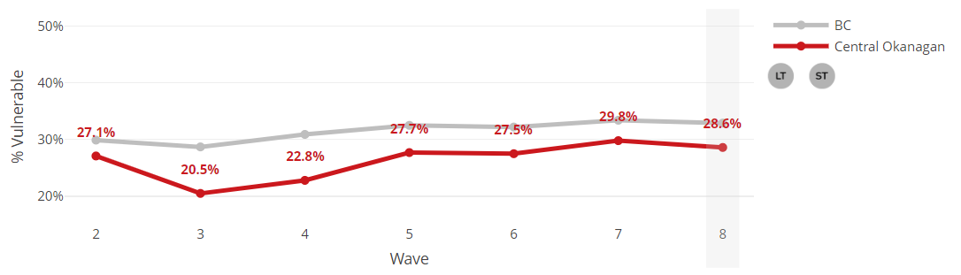
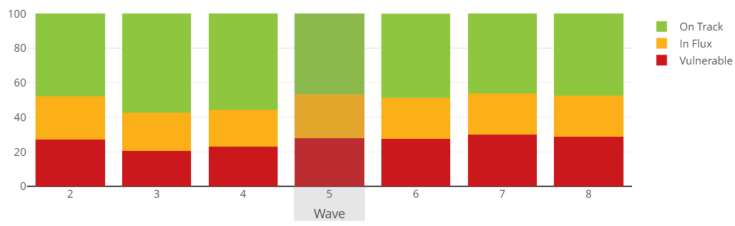
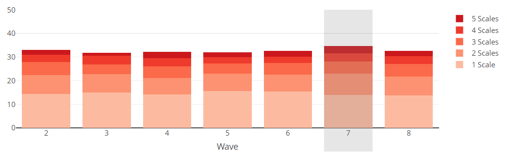
Chart View
Loading...
Scale Outcomes
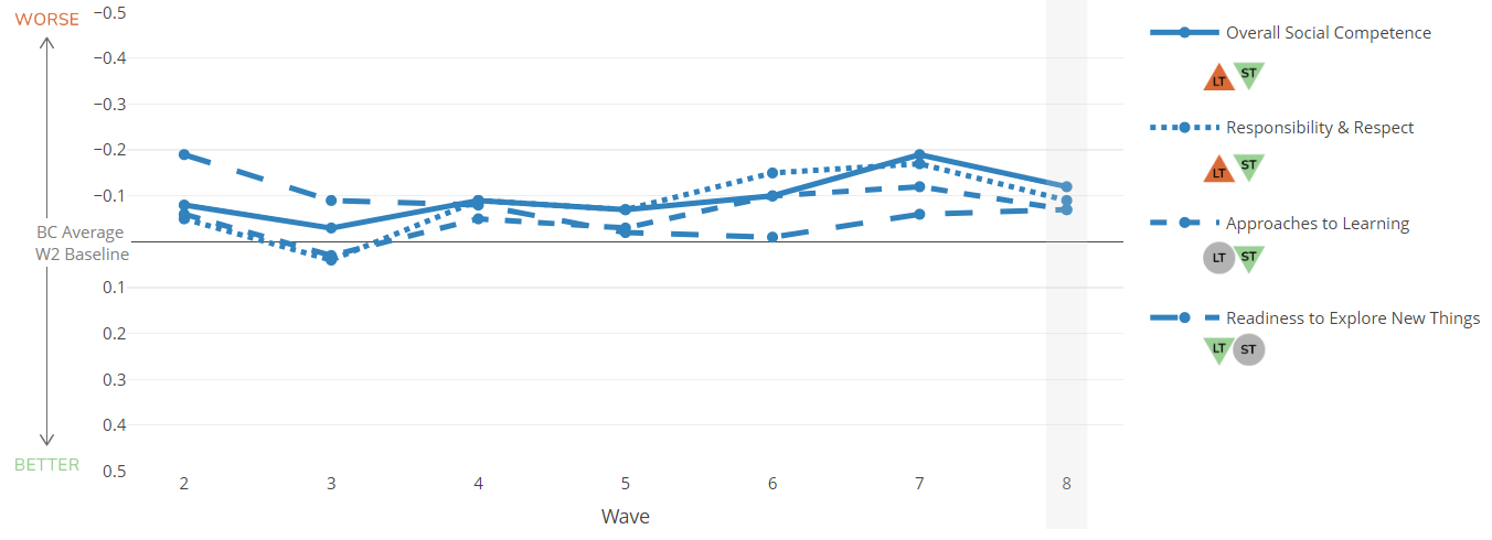
% or kindergarten children in were vulnerable on the Social Competence scale of the EDI in Wave .
Map of Scale Vulnerability
Scale Outcomes summary
Loading...
Range in Vulnerability
Loading...
Scale Trends
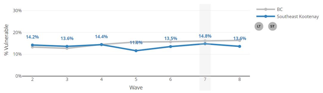
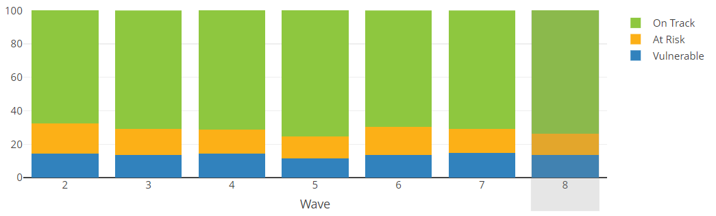
Chart View
Loading...
Subscales
No subscales available
EDI subscales can reveal which developmental areas are contributing to increases or decreases in scale-level vulnerability rates.
Scale Trends
Loading...
Subscale Trends
Loading...
Explore within
There are no data available for Neighbourhood, Community Health Service Area, and MCFD Local Service Area boundary types or for areas with a single sub-region.
Explore within
Map of Vulnerability
Vulnerability & Outcomes
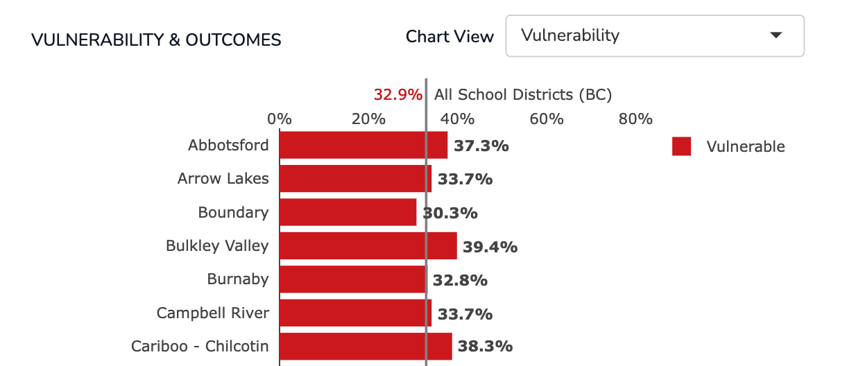
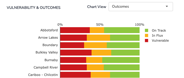
Chart View
Loading...